
What does it take to cook up a truly great website? What separates the good from the bad?
If you’re a small biz owner, you might view your website project as something confusing/vaguely terrifying that requires super-specialized skills. Or magic.

We’re down with the witchy comparison, but we also want to assure you that good web design doesn’t take magical powers. There’s a lot that goes into creating a great website, and we know it can get overwhelming, but all you have to do is get started. Use this post as your jumping-off point.
Let’s talk about the basics of a kickass website, shall we?
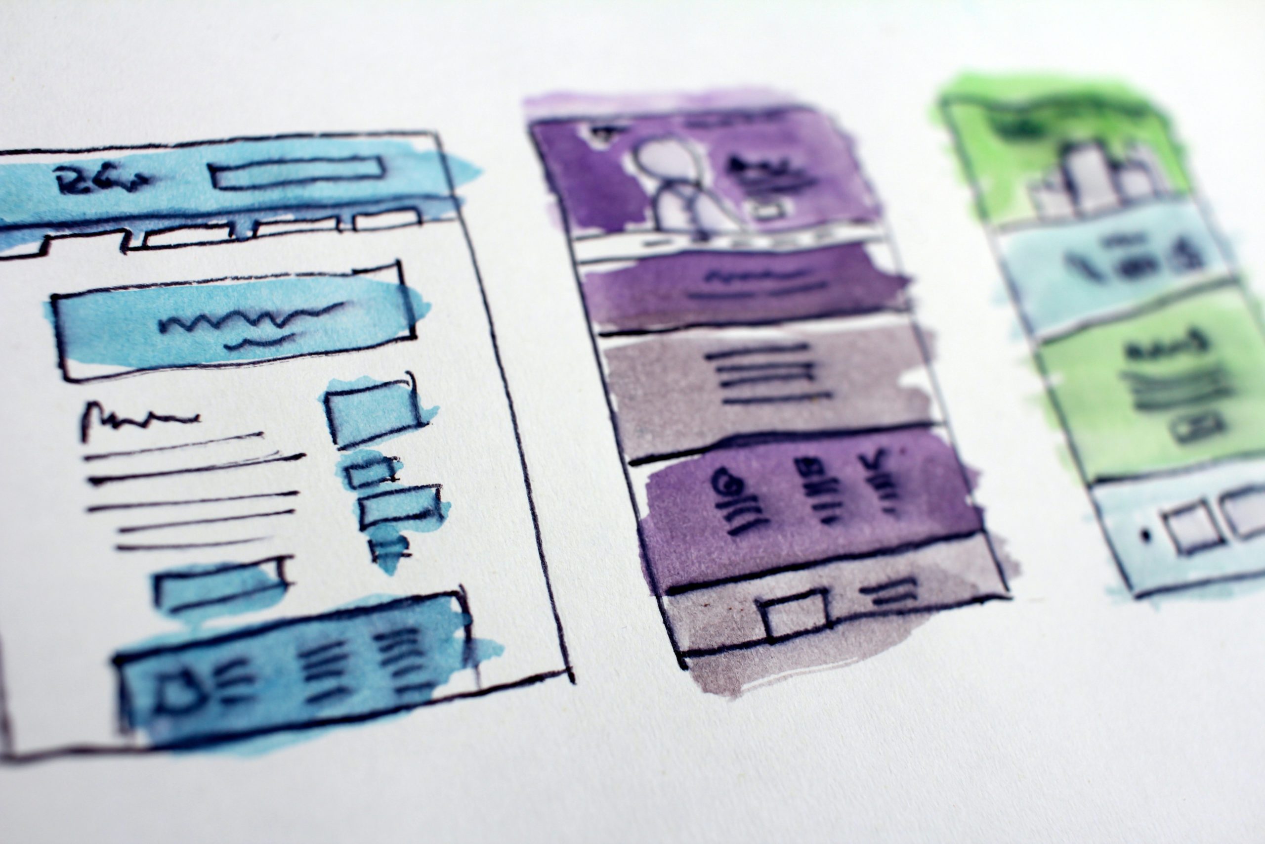
Impressive, intuitive visual design
How your website looks overall is crucial. Yes, we’re copywriters telling you that design matters. And yes, first impressions do matter outside of dating and acing a job interview. You have 50 milliseconds to make a good first impression with your website. That’s 0.05 seconds! Crazy.
So, if your website is overstuffed with graphics, your text is hard to read, or there’s not enough white space on your pages to let everything breathe, your audience will likely bounce and check out a different site.
We’re not going to tell you exactly how you should design your site; we’re content and copy pros, and there are plenty of excellent web designers out there who can better help you. (We are partial to our friend Kristin Stäzrad, who designed the Uncanny Content site.) But we will say that your website design should be intuitive. Organized and easy to read. Simple and straightforward; don’t try to impress your audience with flashy, pointless stuff.
And great visual design goes hand-in-hand with great content.
Amazing content and copy
If you don’t have content that lays a strong foundation for your website, it’s not gonna hold up. Your site may look good designwise, but underneath that pretty face, you gotta have substance and depth. Have you ever visited a good-looking website and then started to read the copy, thinking “Huh?! What the heck does that even mean?”
That is what we want you to avoid. So ask yourself:
- Does your audience immediately know what you offer, how much it costs, and how they can buy what you’re selling? Our attention spans suck. Don’t make your site visitors dig for information.
- Does your content proactively answer other questions that your site visitors have? Maybe you put these questions on a separate FAQ page.
- Does your copy make you recognizable from your competitors? If your site design looks similar to other brands in your industry, you have to distinguish yourself through your content. Use that sparkling brand personality of yours. Your unique voice, values, company mission, or selling points will set you apart from the rest.
Every single page on your site should have cohesive content and copy. Anyone can have a site that looks good and navigates well, but it won’t truly be YOUR site unless the copy is on point.
We believe in this so much that we offer content audits as a service, for crying out loud.
User-friendly navigation
As we said, our attention spans are pretty poor nowadays. People typically leave a website within 10 to 20 seconds! If your website has clunky navigation or doesn’t load quickly, people will dip and find their products or services or answers elsewhere.
Avoid the temptation to “get creative” with your site navigation. There’s plenty of other ways to exercise your creativity when designing your site. This is not one of them. People have expectations for how a site should look and perform. That goes for desktop navigation and the mobile version of your site, too.
How your site navigates might vary depending on your brand or industry, but there are common expectations. Like the fact that major links should be present on your site’s header and footer: services, about page, contact info, etc. Or if you have long, scroll-heavy pages of products you offer, you should probably have a directional button that sends the user back to the top of the page instantly. Make sure that you have mobile- and desktop-friendly navigation, too, as we use websites on different devices differently!
Last but not least, remember that you’re already competing against countless other websites in your niche. Give yourself the best chance of converting a user by ensuring your site loads quickly and is intuitive to use. Then your audience can appreciate how it looks and what you have to say.
Smart branding
We’re vocal advocates of brand voice because it connects you with your unique audience. But your “brand” is more than that. Your brand voice goes hand-in-hand with brand visuals, too.
Color palette, typography, photography, styles for graphics: these all play a part in what your brand looks like. If you built your website and thought, “Well, I’ll just pick the colors I like!” then we’re telling you now, you can do better. Color schemes, typography, and design styles say something about what you do and what you sell.
Don’t believe us? Take a look at these brand color palettes and typography:
- Headspace. The website for this meditation app uses yellow prominently, which can often represent energy, optimism, happiness, sunshine, and warmth. Their text is large and easy to read in a sans serif font.
- Whole Foods. The “first and only certified organic national grocery store” uses a lot of green on their website. Not surprising, since people usually associate green with life, growth, freshness, and the environment. Check out the retro vibes on their choice of type.
- Target. Their color palette may change according to season, but their mainstay color — red — will always suggest excitement, vibrancy, strong emotion, or passion. You can’t miss that bold typeface on their site, either.
- Apple. The absence of color says a lot, too! Apple tends to use mostly white or black color schemes on their website, implying sleekness, technology, precision, and sophistication. Similar to Target, their typeface is bold and simple.
Do some research and check out common colors and fonts used in your industry. Pick a dominant color, then figure out a monochromatic or complementary color palette from there. Whatever font you choose, make sure it’s easily readable. And no Comic Sans. PLEASE.
Nurture your site
Whether you’re building your website on your own or hiring an awesome web designer to do it, take some time to figure out what you want. Hone your brand personality. Plan any changes you want to make. Make those changes and test out your site’s usability, again and again.
When done well, your site can generate big bucks, reel in new clients, and build loyalty with your existing audience. So give it the attention it deserves, k?
If you want a full content & copy audit for your site (as well as recommendations on how your website is organized and optimized), we’re creating a content audit and will have that for you soon. Drop your name and email in the box below if you want the deets as soon as we have them!
