We won’t beat around the bush here: Websites are a lot of fucking work. After all, it’s the portal to your entire business. It’s where audiences learn about what you do, buy your offers, and keep your business afloat. No pressure, right?
That said, it’s normal to make some missteps along the way. Websites are living, evergreen things that need constant attention. But if it sucks, there’s no hiding that from your target audiences and dream clients and customers.
So, where do you go from here? How do you know what – if anything – you might be doing wrong? Here is our list of the top website mistakes you need to stop making ASAP.
1. You have generic 404 pages
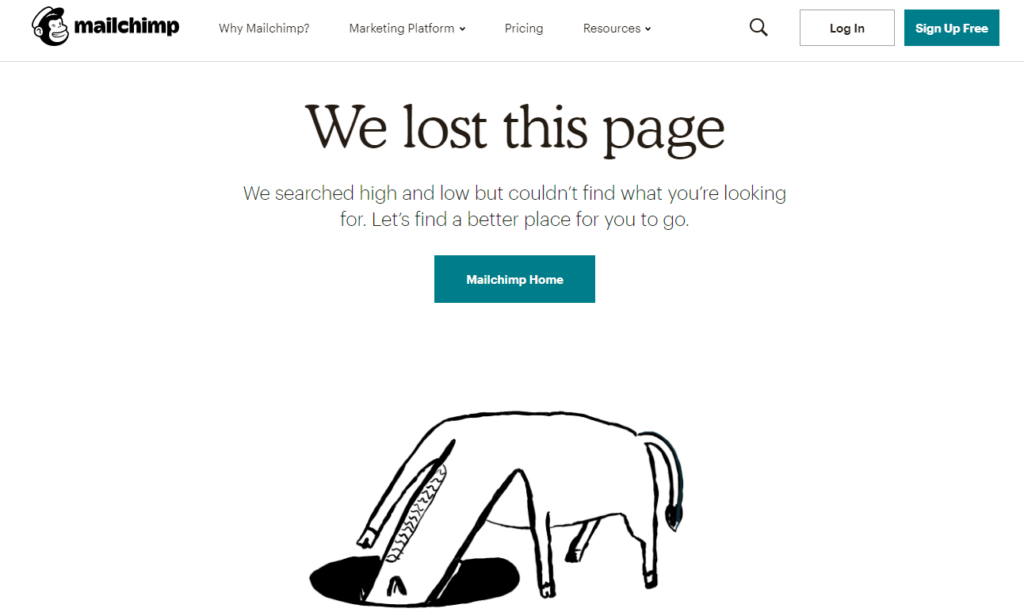
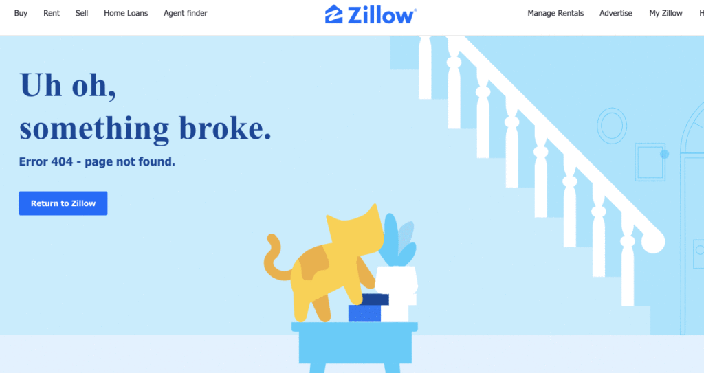
When users click on a web page that’s no longer there, they should get a 404 error. It happens! But the biggest mistake we see with these? They’re boring AF.
Sure, you can stick with generic language that no one understands, or you can make it a lot more fun and keep users on your site. Check out these great examples:


Pro tip: Make sure you add a CTA and/or working links to your 404 page. This way, users don’t have to hit the back button to stay on your site and can get back on track.
2. Your site loads slowly
Patience is a virtue…until it comes to websites loading slowly. In fact, experts say your site should load within three seconds. And if it doesn’t? A huge chunk of your visitors (we’re talking like 40%) is going to leave it. Yikes.
Don’t forget: Site speed is also a big factor for SEO! So, make sure you’re consistently checking your site speed with tools like Goog PageSpeed Insights. It will tell you your site speed on desktop and mobile and flag any concerns to help speed things up.
3. Your images don’t have alt text
Rule of thumb: If you have images on your site, they must have alt text.
Alt text – which means alternative text – is a detailed description of an image. But why does that matter? A few reasons:
- If images aren’t loading on your site, it tells users what the image is supposed to be
- Having alt text ensures those using a screen reader can access descriptions of imagery (in other words: It’s necessary for accessibility)
- Alt text is a best practice for SEO since images are included in your site’s searchable content
4. You don’t have multiple payment options
Debit cards, credit cards, PayPal, Karma, Apple Pay, Bitcoin – there are tons of different ways you can pay for things these days. So, if you’re selling anything, you should offer your audiences the same options. This is especially true if you have higher-priced offers that your customers or clients may not be able to pay in one lump sum.
5. Your content isn’t scannable
It’s crucial to remember that we don’t read online content the same way we do books. We don’t read from left to right and ingest every sentence on the page. Instead, we scan, quickly looking for information that’s most relevant to us.
So, to better cater to these habits, you should make your content scannable AF. That means ditching long, run-on paragraphs and editing your content to include:
- Headers (following an H1-H6 structure)
- Creating bulleted lists where appropriate (like this one)
- Bolding important callouts
- Limiting paragraphs to a few sentences
- Breaking up text with relevant images, videos, or GIFs
6. You don’t have any whitespace
So, this one is more design related, but it’s a hill our team (especially Latasha) will die on because we’re really tired of seeing it.
But wait, what is whitespace?
Whitespace is the areas on a page that have no images, text, icons, designs, colors, etc. – it’s just…whitespace. And the reasons you need whitespace on your site?
- It freaking looks better.
- It lets your content breathe.
- It creates a more pleasurable online experience.
- It prevents migraines from too much shit happening at once.
Here’s a simple but effective example from Adobe:

If you’re looking for more whitespace inspo, we really like this in-depth article from Elementor.
7. You don’t list your mission or values anywhere
In a world of endless choices, brand trust is everything to audiences. Think about it: If a company that sells shoes has some pretty fucked up values, you can get shoes anywhere else. More importantly, you can get shoes from a brand with values you wholeheartedly agree with.
My point? Talk about your mission and values. Make sure it comes through your brand voice. Because if audiences don’t know what – or who – you stand for, chances are they’ll find another business that does.
8. Your buttons and CTAs aren’t clear
The whole point of your website is to get users to convert, right? But if you’re not clear about how you want them to convert, it’s kind of a moot point.
So, as you’re writing your website copy and calls-to-action (CTAs), ask yourself: What action do I want my audience to take here? Download a freebie? Watch a video? Sign up for your latest masterclass? Whatever that is – make it clear AF.
Here are some other tips for great CTAs:
- Make them actual buttons so they stand out from your copy
- Make them descriptive (‘Get your free resource’ vs. ‘Click here’)
- Use accessible-friendly language (‘Explore more videos’ vs. ‘See more videos’)
- For the love of god, don’t say ‘Click here’
A quick note for those last two bullets: It’s good practice to avoid ‘seeing’ terms in your CTAs – like ‘see the results’ – because not all users can see things. Instead, they use a screen reader to navigate websites. That’s also why we don’t want to use generic language like ‘click here.’ Again, users using a screen reader won’t know what – or where – they’re clicking. That’s why the more descriptive your CTAs are, the better.
9. Your site isn’t mobile-friendly
Even if you write, edit, and check your website via desktop, you have to keep in mind that most users are likely accessing your site through their phones. And if your site isn’t equipped for mobile? That’s a big no-no.
So, keep these few things in mind when it comes to your website:
- Design for mobile first. Most users are surfing the web on their phones, and your website is no exception.
- Always test the design and functionality of your site on mobile before publishing any changes.
- Check your website’s device usage more often. You’ll be able to see what portion of your audience is on desktop vs. mobile. (You can find this info in Google Analytics!)
P.S.: Mobile-friendly sites are also a must for SEO!
10. You’re trying to be like everyone else
The last thing we all need is more of the same BS. Instead of trying to fit in – try to stand out. Do what works for you and your audiences and offers, not what works for someone else. Because there’s only one thing that makes you stand out from the competition: you. And if you look like everyone else, what’s the point?
And hey, if you need some help along the way, let us know!

