

Landing pages. You may think of them as spaces that ferry your website users to other, more important pages. Like your online shop or your services page, for example. You might think of them as the boring lobby or reception area of the building that is your website.
While landing pages can point site users in the right direction, they should hook and engage your potential customers, making them want to stay on your website. They should also nudge your website visitors to take a specific action.
So, if your landing pages aren’t thoughtfully and cleverly designed, they won’t serve their purpose. Worse yet, they may even drive your site visitors away.

Byeeee, off to check out a competitor’s website instead.
To take advantage of everything a stellar landing page can do for your biz, you need to check their functionality, design, and copy.
Types of landing pages and what they’re for
Yep… there is more to landing pages than just sales pages and thank you pages. Here are just a few of the landing pages we help create and know can be super useful for your biz:
- Splash pages are often used to collect info from your site user, like a language preference or to communicate an announcement.
- Opt-in pages explain what your opt-in is, why someone would want it, and how to access it. They can be long or short.
- Referral pages thank customers for referring you to a friend.
- Thank you pages show up when your customer has already taken action on your site, by buying a product or filling out a form.
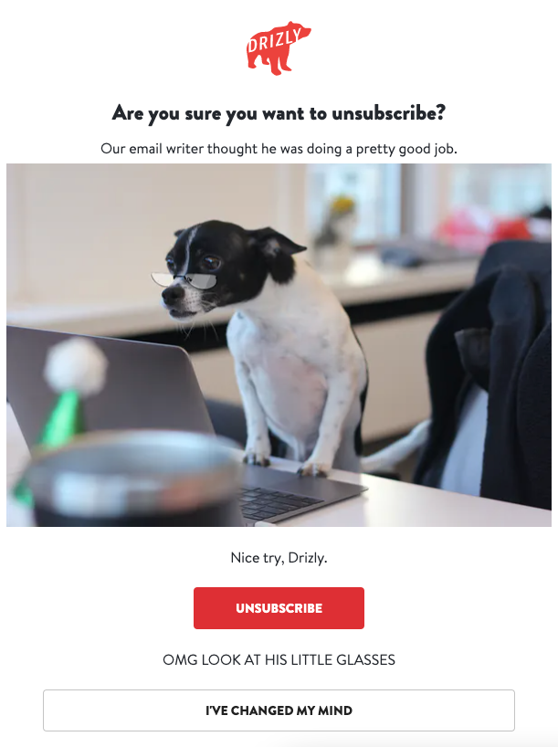
- Unsubscribe pages are used when someone unsubscribes from your email newsletter. They can be functional and generic…or you can inject them with personality to try and win back your customer. Our personal favorite is Drizly’s unsub page. Hell yes, we’ve just changed our mind!
- 404 pages are error pages, yes, but like unsubscribe pages, you can take them to the next level. Have you seen ours? (Click “Surprise” — trust us.)
- Squeeze pages are used to collect a site user’s email address. They’re short and simple and look like popups, so you may not think of them as landing pages, but we’ll include them in this blog because they’re super important.
Now that we’ve covered some of the most commonly used types of landing pages, let’s talk about how you should be using them.
Stick to one offer or purpose
That heading says it all. Don’t try to stuff multiple offers or calls-to-action on one landing page, which can get confusing. Give your site user too many choices, and they may not make any choice at all. Just keep it simple and focus on one offer or purpose. As our friend Nicole Yang says, “make the biggest thing the biggest thing.”
Get to the point with your copy
Speaking of keeping it simple, do the same with your copy. Create an eye-catching headline that will hook your audience immediately and keep them on your site. Here’s an example from a client’s recent challenge:
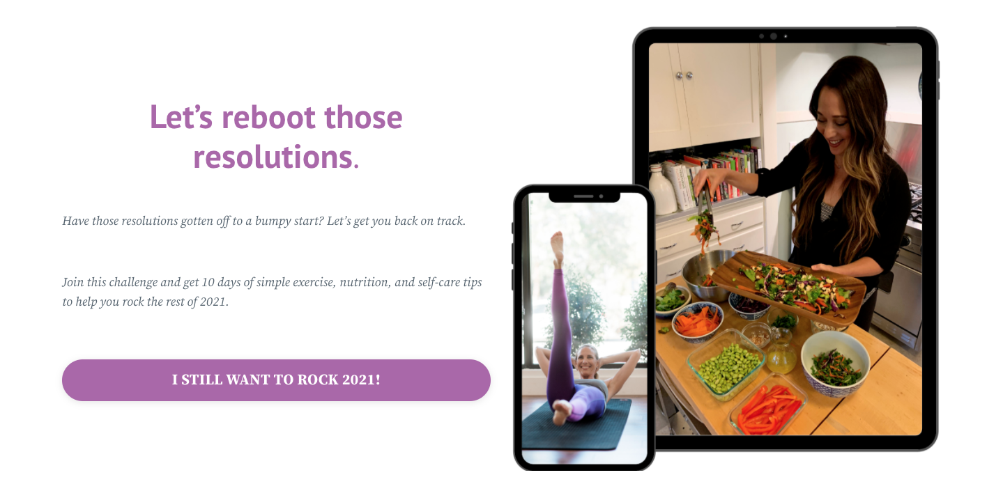
From there, use straightforward and concise language that’s easy to understand. Don’t try to impress your site visitors with jargon or industry speak; keep your copy simple and clear. Also, put your most important info above the content fold so people will see it right away.
Use your CTAs wisely
One offer or purpose? Check. Straightforward copy? Check. Don’t forget the third piece of the puzzle: your call-to-action, or CTA. Your CTA should nudge site users to actually complete the action that you want, like subscribing to your newsletter or accepting a special discount.
Keep your CTAs obvious and short. Make them stand out from everything else on your page, either with color, different fonts, size, placement, or a combination of all of these. Place them in spots that make sense so that your site user doesn’t have to hunt for the link or button.
Bonus tip: Use “I” language — your reader identifies with it and is more likely to click it (like in the challenge image above).
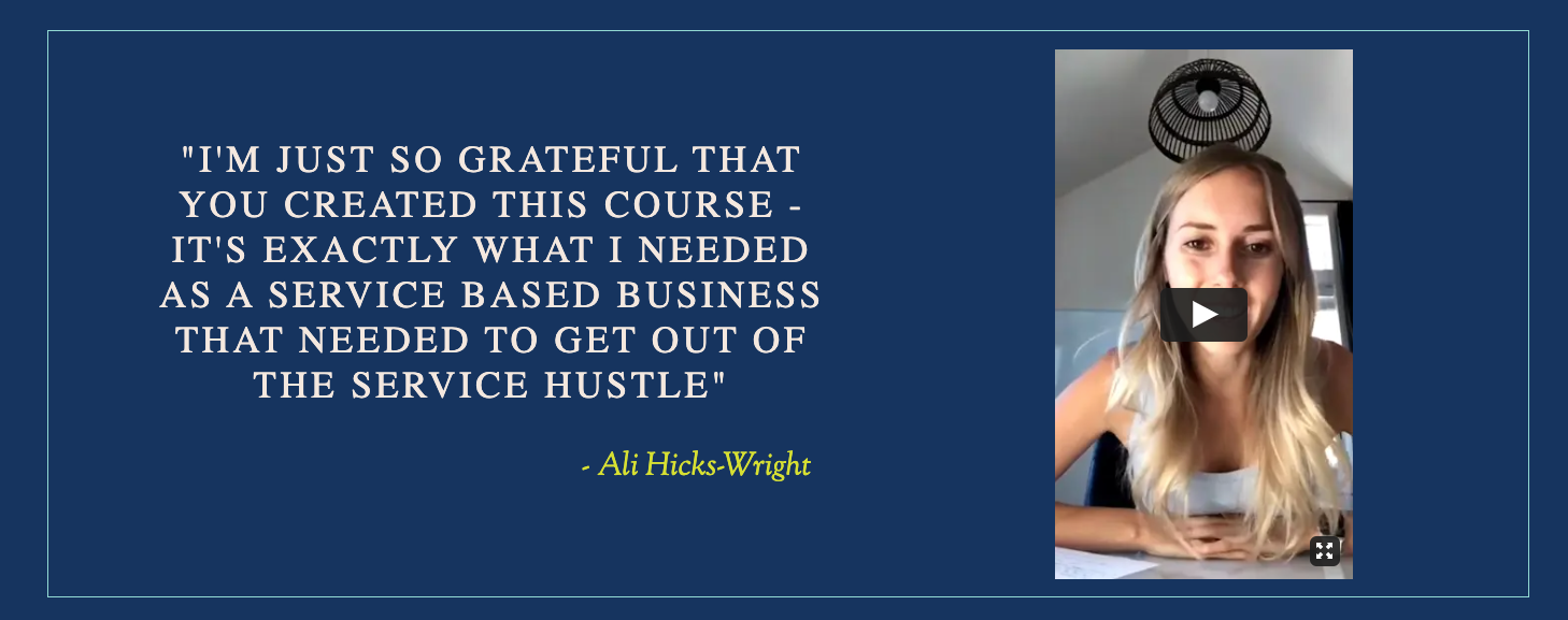
Include customer testimonials
Why should your site visitors take action on your site? Why should they buy your products or sign up for your course or subscribe to your emails?
Don’t do all the persuading yourself. Include customer testimonials on landing pages (when it makes sense) so that your loyal fans can argue for you. People tend to trust online reviews as much as they’d trust good word-of-mouth from friends and family. Extra juicy testimonial tip: use video.
Streamline your design
The overall appearance of your landing page is just as important as what you’re saying and how you say it. Landing pages should be easy to read, with lots of white space, short paragraphs, headings, bullet points, and so on. No one wants to read huge walls of text on a web page.
You can have the most amazing content and copy ever on your landing page, but if your design sucks, your potential customers will get frustrated and bounce.
Good design should also carry into the mobile version of your site. Check that your site loads properly and is just as readable on a phone or tablet. Make sure your images or video aren’t warped by smaller screens. If you have animations or videos, make sure they work before blasting out the landing page.
Check your analytics
Don’t let all that hard work put into your landing pages go to waste. Check your analytics periodically to see if they’re working. Are people visiting? What are they clicking (if anything)? Does your design need tweaking? Do you need to freshen up your copy? Is one design outperforming the other in your A/B testing?
Make your landing pages look good
A killer landing page can generate leads, increase conversations, keep your audience engaged, and create a memorable and positive user experience.
Like any page on your website, you should design and write your landing pages with thought, care, and purpose. Remember to be straightforward, concise, and simple with your copy and design. Use CTAs well, and test the functionality of each page across devices. Don’t just set it and forget it: check in with your landing pages’ performance to see what needs tweaking, too. Oh — and do us a favor. If you’re using templates from your landing page tool or for the copy, at least try to make it look a little unique from all the rest.
