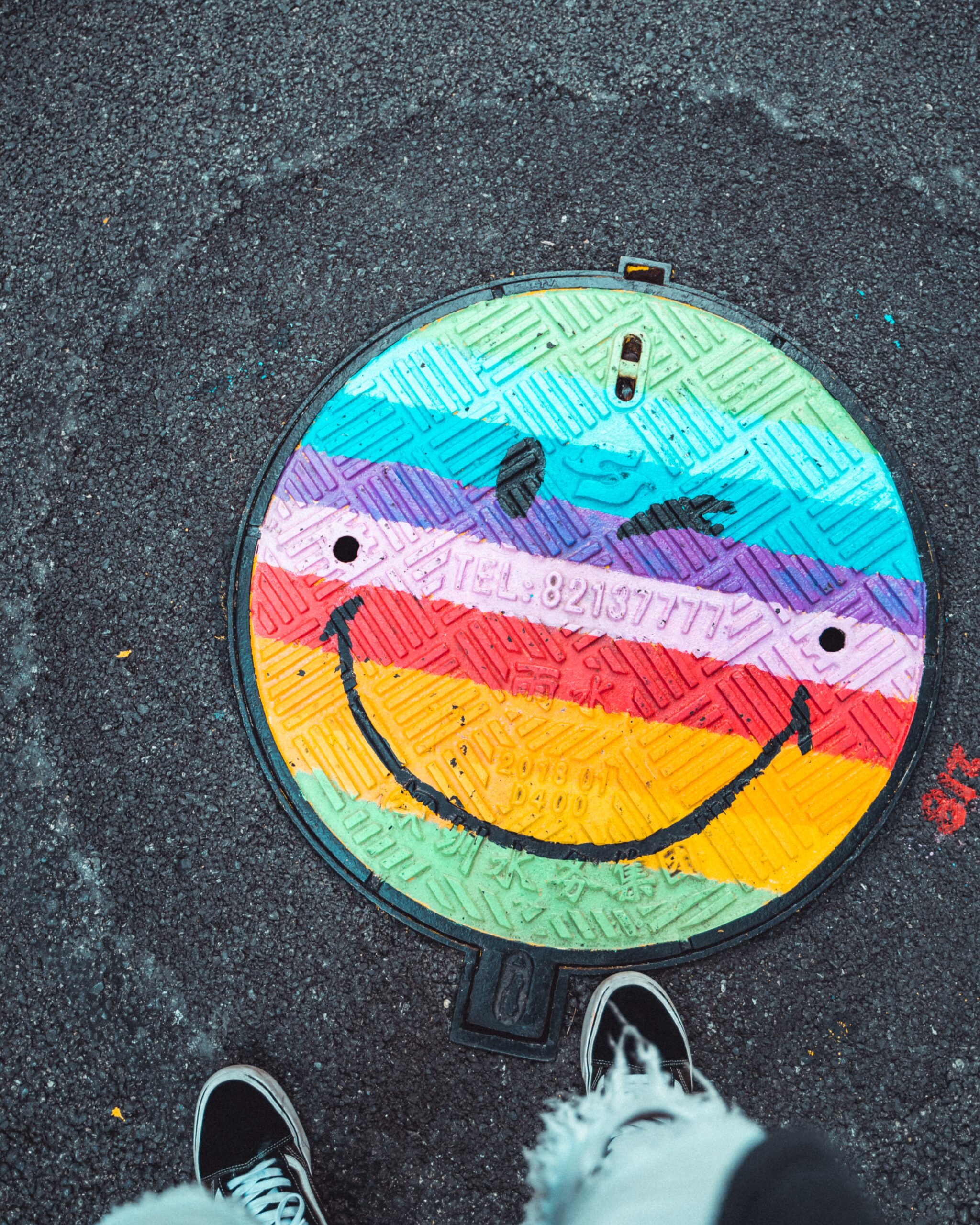
To emoji or not to emoji…that is the question. And the answer? Well, that depends on your brand. What’s right for one brand may not be right for another.
I know you’re sick and tired of us saying that, but it’s the truth. I’m not going to use a string of laughing face emojis for a serious brand. Or the hug emoji for a more sarcastic one (unless it’s…well-placed sarcasm).
Emojis are pretty much everywhere and it’s important that you use them well. But how so? And are there rules for using emojis in your copywriting? Let’s find out!
How using emojis in your copywriting can enhance your content
You probably use loads of emojis in your texts or DMs, but when it comes to content and copy, and sometimes even design, is it okay to use them?
Absolutely. Emojis can do a lot to enhance your brand voice and visual style. You just have to know when to use them.
And know that most of the “rules” for using emojis across any content medium really just come down to personal preference. Go to town with those emojis, as long as it feels natural and on-brand.
Using emojis on your blogs
A lot of this comes down to personal style. Me? I’m not a huge fan of it because I like the classic look and feel of a blog, almost like you’re reading a book. (Yes, Uncanny Content is littered with book nerds, sue us. JK, plz don’t.)
I’d be a little thrown off if I saw the heart eyes emoji in the middle of my latest novella, but lucky for you blogs aren’t novellas. So if you want to add emojis to your blogs — go for it! Just make sure you don’t overdo it.
A few here and there can be tasteful. One every other line is hard to read.
What about your website?
Yes. Yes. And YES! Emojis make a great replacement for things like bullet points and callouts on a website. And depending on your audience, it can be a great way to show people that you’re hip to the trends…or whatever the kids these days are saying.
Here are a few examples of good emoji placement on a website.
Homemade Social
Love the emoji placement within the callouts. Homemade Social also does a great job of pairing them with headings. Because here’s the thing folks — emojis don’t have to be that sort of bold, in-your-face type of style. You can also use them subtly to enhance your design and highlight important copy.


Trena Little
Emojis can be used to reiterate main points, especially when you’ve got a lot of information you’re trying to convey! And adding them at the end of things like paragraphs or columns, like Trena Little does, helps people visualize the importance of that information.

Uncanny Content
What?? #ShamelessPlug. Anyways…who said bullet points have to be boring? Certainly not us. By adding them on each side of the one-liners, you get a cute, neat, and fun way to recap the main points, especially on sales pages where you’re showcasing your offers.

Can emojis work in emails?
Absolutely! There are so many ways you can add emojis within your email content. Places like the subject line, preview text, headings, callouts, and bullet points. And of course, you can use them within the text to spice things up and a little personality to your copy.
How about social media?
A better question to ask is…where can’t you use emojis on social media?
You can use them in the captions, on stories, in Reels, on graphics, etc. for all the reasons I mentioned above! But of course, social media is the land OF emojis, so you can get a little more creative (and generous) with them without it looking overdone.
Notes on accessibility
When it comes to ANY content, make it accessible. I said ANY, so that includes your emojis.
Did you know that most text-to-speech readers can’t pick up emojis? That’s why you need to use emojis to enhance copy, not replace it. That means if you’re using emojis like this, “Guaranteed to make you 🙂” instead of “Guaranteed to make you smile” it’s going to be tough for people to pick up on the missing context.
And while yes, some text-to-speech readers can “read” emojis, it ends up sounding like a really weird string of words like, “slightly peeved face with hands covering eyes on a surfboard.”
Okay, maybe not that random, but how would you feel if every other line of text had an emoji to describe it? It kind of kills the vibe…and the effectiveness of what you’re trying to say. And it feels clunky (and maybe a wee bit disrespectful??) to people who use screen readers and other tools.
Make it a standard: Add emojis to your copy style guide
Emojis can do a lot for your brand, and they can certainly enhance the effectiveness of your copy. But not all are right for your biz. And because branding doesn’t stop at your logo or at your witty catchphrases, add those babies to your brand guidelines!
Not sure what that is? Have your visuals down but need rules for your copy? Check out our post here that gives you the 411 on all things copy style guides!

